
.png)


.png)
7 Proven Designs: What Bottles to Look for as an Entry Level to Rum in 2025
Setembro 2, 2025
Abstract
The selection of a glass bottle for an entry-level rum is a foundational decision that profoundly influences consumer perception, brand identity, and market positioning. This analysis explores the critical factors that emerging rum brands must consider when navigating the complex terrain of glass packaging in the competitive 2025 spirits landscape. It deconstructs the semiotics of bottle design, examining how shape, weight, color, and closure contribute to a narrative of quality and authenticity. The investigation proceeds by outlining seven distinct and proven bottle archetypes, ranging from the cost-effective ‘Bar Standard’ to the more evocative ‘Decanter-Inspired’ style. For each archetype, a detailed examination is provided, weighing its aesthetic implications, economic viability, and suitability for different rum profiles and brand stories. The objective is to equip new brand owners with a structured framework for making an informed choice, one that harmonizes the practical constraints of a startup with the aspirational goal of creating a memorable and desirable product. This guide serves as an essential resource for understanding what bottles to look for as an entry level to rum.
Key Takeaways
- Bottle shape and weight are primary communicators of your rum’s price point and heritage.
- For entry-level rums, leveraging stock bottles with creative labeling is a cost-effective strategy.
- The closure, whether cork or screw cap, significantly impacts the consumer’s unboxing experience.
- Understanding what bottles to look for as an entry level to rum involves balancing cost and aesthetic.
- Darker glass offers better UV protection for the spirit, preserving its intended flavor profile.
- Textured glass can elevate perceived value by creating a unique tactile and visual experience.
- Your bottle choice should align with your target demographic’s values and aesthetic preferences.
Table of Contents
- The Foundational Principles of Rum Bottle Selection
- Design 1: The Classic ‘Bar Standard’ Bottle
- Design 2: The Stout and Sturdy ‘Pirate’ Bottle
- Design 3: The Elegant ‘Apothecary’ Style
- Design 4: The Sleek and Minimalist ‘Modernist’ Bottle
- Design 5: The Ornate and Embossed ‘Premium Impostor’
- Design 6: The Decanter-Inspired ‘Showstopper’
- Design 7: The Textured and Tactile Bottle
- Frequently Asked Questions (FAQ)
- Conclusão
- References
The Foundational Principles of Rum Bottle Selection
Before we can meaningfully discuss specific bottle shapes, we must first establish a shared understanding of the language they speak. A bottle is never just a vessel; it is a silent narrator, the first chapter of your brand’s story that a customer reads. This communication happens in an instant, on a crowded shelf, long before the first drop of rum is ever tasted. The decision-making process for a consumer is a complex interplay of conscious reasoning and subconscious emotional response, and the physical object of the bottle is at the very center of this dialogue. As a packaging professional with over a decade of experience, I have seen countless brands succeed or falter based on this initial choice. Let us, therefore, break down the fundamental elements that constitute this powerful, non-verbal language.
Understanding the Consumer’s Gaze: The Psychology of Shape and Color
The human brain is a remarkable machine for pattern recognition and symbolic association. When a potential customer scans a wall of spirits, their eyes are not just seeing glass; they are interpreting signals.
A tall, slender bottle, for instance, often communicates elegance, modernity, and lightness. Think of the silhouette of a skyscraper or the profile of a champagne flute. These associations, culturally embedded over decades, can suggest a refined, sophisticated spirit, perhaps a light white rum suited for upscale cocktails. This shape draws the eye upward, creating a sense of aspiration.
Conversely, a short, stout, broad-shouldered bottle speaks a different language. It feels grounded, stable, and robust. Its lower center of gravity gives it a sense of presence and history. This is the shape of heritage, of tradition, of something that has stood the test of time. It is no surprise that many dark, aged, or spiced rums—products that lean on a narrative of history and rich flavor—gravitate toward this form. It feels substantial in the hand and on the shelf.
The color of the glass is equally potent.
- Flint (Clear) Glass: This is the color of honesty and confidence. It says, “I have nothing to hide.” It is the perfect choice for showcasing a visually appealing liquid, such as a crystal-clear white rum or one with a unique, natural hue from infusion. The transparency allows the quality of the spirit itself to be the hero.
- Amber (Brown) Glass: Amber glass is the color of tradition and protection. Historically, it was used for its ability to block harmful ultraviolet light, which can degrade the complex organic compounds in aged spirits (Uylaşer & Yildiz, 2014). This functional benefit has morphed into a powerful psychological signal. It suggests an aged product, something that has been cared for and matured over time, making it an intuitive choice for aged and dark rums.
- Antique Green Glass: This color shares some of the traditional connotations of amber but with a slightly different flavor. It can evoke a sense of the nautical, of old wine bottles or ship’s lanterns, making it a particularly fitting choice for a spirit so intertwined with maritime history.
The Economics of Glass: Balancing Customization and Cost
For any new venture, the budget is a primary constraint. The world of custom spirits glass bottles is vast, but it can be broadly divided into two territories: stock bottles and custom molds.
A custom mold offers the ultimate freedom. You can create a bottle that is utterly unique to your brand, with your logo embossed directly into the glass and a shape that no one else has. This is a powerful tool for differentiation. However, it comes with a significant upfront cost for the mold itself—which can run into many thousands of dollars—and often requires very high minimum order quantities (MOQs). For an entry-level product, this is rarely a viable path.
This is where the humble stock bottle becomes your greatest ally. Stock bottles are designs that a manufacturer produces for any number of clients. Because the molds already exist and production runs are large, the per-unit cost is dramatically lower. The misconception is that “stock” means “generic.” This is far from the truth. A good manufacturer will have a catalog of hundreds of stock designs, from the most basic to the surprisingly ornate. The art of bottling an entry-level rum is not about reinventing the wheel, but about choosing the right wheel and then adding your own unique hubcaps—the label, the closure, the capsule. This approach allows you to channel your precious capital into the liquid and the marketing, rather than sinking it into a custom mold.
| Caraterística | Impact on Consumer Perception | Typical Cost Implication | Branding Tip for Entry-Level Rum |
|---|---|---|---|
| Glass Weight (Heft) | A heavier bottle, especially with a thick base, is almost universally perceived as more premium and valuable. | Higher weight equals more raw material and higher shipping costs. | Opt for a medium-weight bottle with a visually thick base (a “sham”) to create a premium feel without maximum cost. |
| Closure Type | A natural cork or wood-topped cork signals tradition and a premium sipping experience. A screw cap suggests convenience and mixability. | Natural corks and custom-topped stoppers are more expensive than standard T-corks or metal screw caps. | A high-quality synthetic T-cork can provide the “pop” and ritual of a natural cork at a more accessible price point. |
| Glass Color | Clear glass showcases the liquid’s color. Amber/dark glass suggests age and protects from UV light. | Standard flint (clear) and amber glass are typically the most cost-effective. Custom colors or frosted finishes add cost. | Choose a color that aligns with your rum’s story. Use clear for a white rum, amber for a spiced or gold rum. |
| Bottle Shape | Tall/slender shapes feel modern and elegant. Short/stout shapes feel traditional and robust. | Unique or complex stock shapes may carry a small premium over the most common “bar standard” cylinders. | Select a stock shape that best reflects your brand’s core identity (e.g., Apothecary for a botanical rum). |
Closures and Finishes: The Unspoken Details
The experience of opening a bottle is a small but deeply significant ritual. The choice of closure is a key part of this.
- Natural Cork: The classic choice. The gentle resistance, the satisfying “pop”—it is a multi-sensory experience that signals quality. It is best suited for rums intended to be sipped and savored.
- Synthetic T-Cork: A brilliant compromise for entry-level brands. It offers the same ritual and resealability as a natural cork but at a lower cost and with no risk of “cork taint.” The top can often be customized with a logo, adding a touch of bespoke branding.
- Screw Cap: Often unfairly maligned, the modern screw cap can be an excellent choice. It offers a perfect seal, is easy to use, and communicates convenience. For a rum primarily intended for cocktails in a high-volume bar or for casual home mixing, a well-made screw cap is a practical and logical choice. It signals that the product is approachable and unfussy.
The finish of the bottle—the shape of the neck and lip that mates with the closure—is another detail that adds to the overall impression. A thick, pronounced lip can make a bottle feel more substantial, while a delicate, tapered neck can enhance its feeling of elegance. These are subtle cues, but they all contribute to the final composition.
Design 1: The Classic ‘Bar Standard’ Bottle
Let us begin our exploration of specific designs with the most ubiquitous and perhaps most versatile option: the ‘Bar Standard’. You know this bottle intimately, even if you have never consciously registered it. Picture a typical bar rail—the rows of gin, vodka, whiskey, and rum ready for the bartender’s hand. Many of them will live in this bottle. It is typically a tall, cylindrical bottle with a gentle slope to the shoulder and a medium-length neck. It is the workhorse of the spirits industry.
Why It Works for Entry-Level Rum
The primary virtue of the Bar Standard bottle is its economic efficiency. It is, without a doubt, the most cost-effective bottle shape to produce and procure. Every major glass manufacturer has multiple variations of this design in their catalog, which means supply is plentiful and pricing is highly competitive. For a new brand where every cent counts, this is a monumental advantage.
Its ubiquity is also a strength. It is instantly recognizable to consumers as a bottle of spirits. There is no learning curve, no hesitation. It fits perfectly in a bartender’s speed rail and is easy to handle and pour, a practical consideration that should not be overlooked if you want your rum to be adopted by bars and restaurants. Its simple, uniform shape also makes it efficient to pack and ship, a small but meaningful saving on logistics costs.
Branding Opportunities on a Blank Canvas
The simplicity of the Bar Standard is not a weakness; it is an opportunity. Think of it as a perfectly primed blank canvas. With this bottle, the label is not just part of the design; it is the design. All the personality, all the storytelling, all the visual excitement of your brand must be communicated through the paper, ink, and foil you apply to its surface.
This forces a wonderful discipline. You can invest your creative energy and budget into a truly spectacular label. Consider a die-cut shape that breaks the traditional rectangle, a textured paper stock that feels wonderful to the touch, or the strategic use of metallic foils and embossing to catch the light. Because the bottle itself is understated, these details on the label will shine all the more brightly. The closure also becomes a key branding point. A simple Bar Standard bottle can be instantly elevated with a custom-colored capsule or a wood-topped T-cork.
Case Study (Hypothetical): “Coral Key White Rum”
Imagine a new brand called Coral Key White Rum. They want to evoke the bright, sunny, easy-going spirit of the Florida Keys. Their liquid is a crisp, clean white rum perfect for daiquiris and mojitos. They choose a standard flint glass Bar Standard bottle. It is cost-effective and shows off the pristine clarity of their spirit.
Their entire brand identity is then poured into the label. They use a wrap-around label printed on a slightly textured, off-white paper stock that feels organic and natural. The design is a beautiful, watercolor-style illustration of a coral reef in vibrant teals, pinks, and oranges. The brand name is in a relaxed, flowing script font. The finishing touch is a simple, light-colored wood top on their T-cork, reinforcing the natural, beachy aesthetic. On the shelf, the bottle shape is familiar, but the label is a beacon of color and artistry that tells a complete story of sun, sea, and relaxation. It looks both premium and approachable, the perfect execution for an entry-level white rum.
Design 2: The Stout and Sturdy ‘Pirate’ Bottle
Now, let us shift our focus to a bottle with a completely different personality. This is the ‘Pirate’ bottle—a name I use to evoke its character, not its literal contents. This style is shorter, wider, and more robust than the Bar Standard. It often has a shorter neck and a more pronounced, rounded shoulder. The overall impression is one of weight, history, and substance. It is the kind of bottle you could imagine being unearthed from a sunken galleon or passed around a tavern table centuries ago.
Evoking Tradition and Authenticity
The power of this bottle shape lies in its deep-seated connection to the history of rum. Rum’s story is one of sailors, trade routes, and tropical islands. This stout, sturdy bottle shape taps directly into that collective memory. It feels authentic. It feels like it has a story to tell before you have even read the label.
This makes it an exceptionally good choice for certain types of rum. A dark, molasses-rich rum, an aged expression, or a bold spiced rum all feel right at home in this kind of vessel. The shape itself implies a rich, flavorful, and perhaps more intense experience. When a consumer sees this bottle, their mind is already being primed for notes of caramel, oak, and spice. It is a powerful piece of psychological stage-setting. Often, these bottles are made from amber or antique green glass, which further enhances the historical, aged feel and provides the functional benefit of protecting the complex flavors of a dark spirit from light.
Considerations for Labeling and Handling
The wider body of the Pirate bottle offers a different kind of canvas than the Bar Standard. The increased surface area can accommodate larger, more panoramic labels. It is also well-suited to medallion-style labels or smaller, irregularly shaped labels that leave much of the dark glass exposed, adding to the mystique.
However, there are practical considerations. Its wider footprint means it takes up more space on a retail shelf and in a shipping case. This can be a double-edged sword. While it might be slightly less efficient from a logistics standpoint, its broader profile gives it a greater physical presence on the shelf, allowing it to stand out from its taller, thinner neighbors. It is a trade-off between logistical efficiency and visual dominance. Bartenders may also find it slightly less nimble to handle than a Bar Standard bottle, but its distinct shape can make it a memorable “call bottle” that customers ask for by sight.
When to Choose This Style
You should gravitate toward this style if your brand’s story is rooted in history, adventure, or traditional craftsmanship. If your rum is dark, spiced, or has a bold, unapologetic flavor profile, this bottle will feel like its natural home. It is for the brand that wants to project a sense of rugged authenticity over sleek modernity.
Think of a hypothetical brand, “Old Salt Spiced Rum.” Their story is about the old maritime spice routes. They use a dark amber Pirate-style bottle. Their label is small and designed to look like a weathered piece of parchment, tied to the neck with a piece of rough twine. A simple wax seal over the cork completes the package. The bottle itself does most of the work. It looks like it belongs in the world of its story. It is a perfect example of how the right bottle shape can be the most potent element of your branding, creating an immediate and compelling narrative.
Design 3: The Elegant ‘Apothecary’ Style
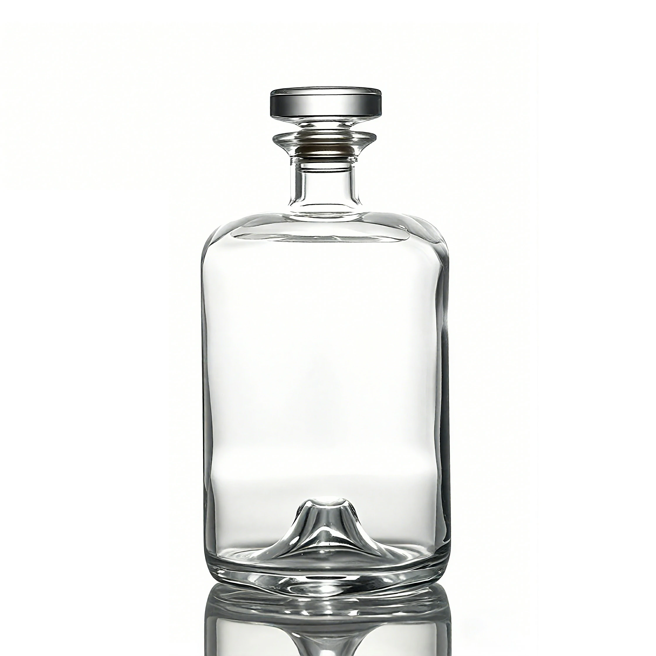
Let us now consider a design that bridges the gap between the old world and the new: the Apothecary bottle. This style takes its design cues from old medicinal and pharmacist’s bottles. It is typically characterized by clean, straight lines, often a cylindrical or slightly rectangular body, a sharp transition at the shoulder, and a short neck, usually finished for a cork. The overall aesthetic is one of precision, cleanliness, and purpose. It feels less like a vessel for revelry and more like a container for a carefully crafted elixir.
Projecting Craft and Botanical Notes
The Apothecary style has seen a massive surge in popularity, largely thanks to the craft gin boom. Gin, with its focus on botanical distillates and precise recipes, found its perfect visual match in this bottle shape. It communicates a sense of scientific rigor and artisanal craft. This aesthetic can be borrowed with great effect for certain types of rum.
This bottle is the ideal choice for a modern rum that pushes the boundaries of the category. Perhaps it is a white rum infused with a unique blend of local botanicals, a spirit that blurs the line between rum and gin. Or maybe it is a rum that emphasizes a particularly clean, precise distillation process. The Apothecary bottle visually reinforces these ideas. It tells the consumer to expect something different, something crafted with intention and a “less-is-more” philosophy. It suggests a focus on bright, clean, and perhaps complex herbal or floral notes, rather than the heavy, sweet notes of molasses and caramel often associated with traditional rums.
Balancing Modernity with Timelessness
One of the great strengths of the Apothecary style is its timeless quality. It feels both historical—evoking 19th-century science—and completely contemporary in its minimalist simplicity. This duality makes it incredibly versatile. It can sit comfortably in a speakeasy-style bar with vintage decor, and it looks equally at home on the shelf of a hyper-modern, minimalist apartment.
This timelessness allows the brand to avoid being pinned to a passing trend. The bottle provides a clean, stable foundation upon which a variety of branding styles can be built. A label with a vintage, engraved illustration style will look just as appropriate as one with bold, modern typography. This flexibility is invaluable, especially for a new brand that may need to evolve its marketing over time. The bottle itself provides a classic, enduring anchor. Exploring a diverse rum glass bottle selection can reveal numerous variations on this theme, from short and stout to tall and slender, all sharing that core Apothecary DNA.
A Look at Application: “Terroir White Rum”
Imagine a brand called “Terroir White Rum.” Their unique selling proposition is that they use sugarcane grown in a specific volcanic soil, and their fermentation process uses wild, local yeasts, resulting in a spirit with a unique, mineral-driven flavor profile. They are targeting discerning drinkers who appreciate wine and are interested in the concept of terroir in spirits.
The Apothecary bottle is the perfect choice. They select a clear flint glass version to showcase the rum’s purity. Their label is stark and minimalist, resembling a scientific sample label. It features simple, black serif typography detailing the sugarcane varietal, the harvest date, and the specific coordinates of the field where it was grown. The closure is a simple black T-cork. The entire package speaks of precision, provenance, and craft. It does not scream “party”; it whispers “complexity.” It is a bottle that invites curiosity and promises a unique tasting experience, perfectly aligning the packaging with the product’s sophisticated story.
Design 4: The Sleek and Minimalist ‘Modernist’ Bottle
Our journey now takes us to the cutting edge of bottle design with the ‘Modernist’ style. This approach is defined by what it removes rather than what it adds. It favors clean geometric shapes—sharp rectangles, pure cylinders, or sometimes subtle tapers—with an absolute minimum of ornamentation. The surfaces are often smooth and unadorned, with frosted or matte finishes being common choices to diffuse light and create a soft, ethereal glow. The Modernist bottle is the architectural equivalent of a Mies van der Rohe building: less is more.
Targeting a New Generation of Rum Drinkers
This design aesthetic speaks directly to a younger, design-conscious, urban demographic. These are consumers who appreciate the clean lines of Scandinavian furniture, the user-friendly interface of their smartphones, and the minimalist branding of modern fashion labels. They are often skeptical of overwrought, traditionalist marketing. For them, quality is communicated through confident simplicity, not ornate decoration.
By choosing a Modernist bottle, a rum brand can immediately signal that it is part of this contemporary cultural landscape. It positions the rum not as a relic of a bygone era but as a spirit for today. This is an excellent strategy for a brand aiming to break the old stereotypes associated with rum and present it as a sophisticated, versatile white spirit, on par with premium vodka or gin for contemporary cocktails. It is a bottle that feels at home in an art gallery, a design studio, or a trendy cocktail bar.
The Power of Simplicity and Liquid Focus
In a retail environment filled with colorful labels and complex bottle shapes all vying for attention, a minimalist bottle can, paradoxically, stand out the most. Its quiet confidence can be a beacon of calm in a sea of visual noise. This approach inherently shifts the focus away from the packaging and onto the liquid within.
When the bottle is a simple, frosted vessel, the subtle color and viscosity of the rum become more apparent. The branding often takes a similarly minimalist approach. Instead of a paper label, the brand name might be screen-printed directly onto the glass in a single, elegant font. This technique, where the brand becomes one with the bottle, creates a seamless and highly premium feel. The message is clear: “We are so confident in the quality of our spirit that we do not need to shout about it.” This understated approach can build a powerful sense of intrigue and perceived value (Orth & Malkewitz, 2008).
Elevating the Simple Form
While the form itself is simple, the execution must be flawless. The quality of the glass, the precision of the screen printing, and the design of the closure are paramount. A Modernist bottle can be elevated through subtle, intelligent details.
- A Unique Closure: A brushed aluminum screw cap or a polished chrome stopper can provide a striking point of contrast to the soft, frosted glass.
- A Single Point of Color: A small, brightly colored logo, a colored neck ring, or a vibrant tamper seal can create a dramatic visual focal point against the neutral backdrop of the bottle.
- Subtle Asymmetry: A slightly off-center label or an unusual bottle proportion can add a touch of avant-garde personality without sacrificing the minimalist ethos.
Consider a hypothetical brand, “Axis White Rum.” They choose a tall, rectangular bottle made of frosted glass. The brand name “AXIS” is screen-printed vertically down one corner in a clean, sans-serif font. The only other detail is the cap: a high-quality, polished black screw cap that provides a sharp, graphic contrast. The bottle looks more like a piece of modern sculpture than a traditional rum container. It signals a premium, design-led product and would instantly appeal to a consumer who values aesthetics and modernity. It is a bold statement that the rum inside is as clean and contemporary as the vessel that holds it.
Design 5: The Ornate and Embossed ‘Premium Impostor’
We now arrive at a fascinating and strategically astute category: the ‘Premium Impostor’. This term is not meant to be pejorative; rather, it describes a stock bottle that has been cleverly designed to mimic the appearance of a much more expensive, fully custom bottle. These bottles achieve this effect through built-in decorative elements like light embossing, unique shoulder structures, or subtle faceting. They represent a smart middle ground, offering a touch of bespoke character without the prohibitive cost of a private mold.
Achieving a Premium Look on a Budget
The fundamental challenge for an entry-level brand is to project a high-quality image while managing a tight budget. This is precisely where the Premium Impostor shines. A manufacturer might have a stock bottle with a subtle pattern, like a diamond or honeycomb design, embossed onto the shoulder or base. Or perhaps it is a bottle with a distinctive, heavy-looking sham (the thick glass at the bottom) that gives it the weight and feel of a super-premium spirit.
These details, which are part of the stock mold, add a layer of texture and visual interest that a standard cylindrical bottle lacks. The per-unit cost is only marginally higher than a basic Bar Standard bottle, but the perceived value in the eyes of the consumer can be significantly greater. It is a form of design arbitrage, leveraging the manufacturer’s existing capabilities to give your product an immediate visual lift. It helps the bottle look like it was made just for your brand, even when it was not.
Integrating Embossing with Label Design
The key to successfully using a Premium Impostor bottle is to work with its existing features, not against them. The label design must be conceived in harmony with the bottle’s built-in ornamentation.
For example, if the bottle has an embossed crest on the shoulder, do not cover it with a label. Instead, design a label that sits below it, perhaps with a shape that echoes the crest’s outline. This creates a cohesive design language where the bottle and label appear to have been designed as a single unit. If the bottle has faceted sides, you might use a smaller label that sits on a single flat panel, allowing the facets to catch the light and frame the branding. The goal is to create a symbiotic relationship. The embossing elevates the label, and the label gives context and meaning to the embossing.
Finding the Right Manufacturing Partner
Accessing this category of bottle requires a good relationship with a capable manufacturing partner. Not all glass producers have a deep catalog of these more ornate stock bottles. A large, experienced manufacturer, however, will have invested in a wide variety of molds over the years to serve a diverse clientele. It is worth spending time reviewing a supplier’s catalog in detail. When you find a manufacturer that offers these kinds of elevated stock options, you have found a valuable partner who can help you punch above your weight class in the retail aisle. Discussing your brand vision with their team can often uncover a stock bottle you never knew existed that happens to be a perfect fit for your story. This is a testament to the value that a leading glass packaging manufacturer brings to the table—not just production, but a library of design solutions.
Imagine a new spiced rum brand, “The Gilded Cage.” They want a look that is opulent and slightly mysterious. They cannot afford a custom mold. By working with their supplier, they find a stock bottle that is squarish in shape and has a subtle, embossed Art Deco-style fan pattern on the shoulders. It is the perfect fit. They design a deep navy blue label with gold foil lettering that sits on the main body of the bottle. The brand name is framed by the embossed fans above it. The result is a package that looks incredibly luxurious and bespoke, as if it belongs in a high-end cocktail lounge, yet it was achieved using a clever and affordable stock bottle.
Design 6: The Decanter-Inspired ‘Showstopper’
Let us now turn our attention to a bottle that is designed not just to hold rum, but to celebrate it. The Decanter-Inspired bottle is a statement piece. It borrows its design language from the heavy, ornate crystal decanters used for serving fine spirits like cognac and whiskey. Key characteristics include a wide, often squat body, a very thick and heavy glass base (sham), and a prominent, oversized stopper, often with a wood or glass top. This bottle is not meant to be hidden on a speed rail; it is designed to be displayed on a bar cart or the top shelf.
Making a Statement on the Shelf and Bar Cart
The primary function of the Decanter-Inspired bottle is to create an undeniable sense of premium quality and occasion. Its sheer physical presence—the weight in the hand, the way light refracts through the thick base—sends an immediate and powerful message: this is a spirit to be sipped, savored, and respected. It is not for casual mixing; it is for thoughtful contemplation.
For an entry-level rum, choosing this style is a bold and ambitious move. It positions the product directly against more established, premium brands. This can be a highly effective strategy if the liquid inside can live up to the promise of the packaging. It is a way of saying, “We may be new, but we belong in the top tier.” This bottle is a conversation starter. It catches the eye, invites touch, and creates a memorable unboxing and pouring ritual that adds significant value to the overall brand experience (Hine, 1995).
| Bottle Style | Primary Brand Message | Ideal Rum Profile | Cost Index (Relative) | Target Consumer |
|---|---|---|---|---|
| 1. Bar Standard | Approachable, Versatile, Classic | White, Gold, Lightly Spiced | 1.0x | Casual mixers, high-volume bars |
| 2. Pirate Bottle | Authentic, Traditional, Robust | Dark, Aged, Navy Strength, Spiced | 1.2x | Rum enthusiasts, history buffs |
| 3. Apothecary | Crafted, Botanical, Precise | Modern White, Infused, Botanical | 1.3x | Gin drinkers, cocktail connoisseurs |
| 4. Modernist | Sleek, Contemporary, Design-led | Premium White, Lightly Aged | 1.4x | Urban millennials, design-conscious |
| 5. Premium Impostor | Smart, Ornate, Value-Premium | Gold, Spiced, Entry-Level Aged | 1.3x | Aspirational buyers, gift-givers |
| 6. Decanter-Inspired | Luxurious, Sipping, Celebratory | Premium Aged, Special Reserve | 1.8x | Connoisseurs, luxury market |
| 7. Textured Bottle | Artisanal, Tactile, Unique | Any style seeking differentiation | 1.5x | Exploratory drinkers, craft lovers |
Cost vs. Perceived Value: A Strategic Gamble
This bottle style is undeniably one of the more expensive stock options. The increased amount of glass required for the heavy base and the more complex manufacturing process contribute to a higher per-unit cost. The oversized stopper is also a significant cost component compared to a simple T-cork or screw cap.
However, the brand is making a strategic calculation. The hope is that the dramatic increase in perceived value will more than justify the added expense. A consumer might be willing to pay $35 for a rum in a decanter-style bottle that they would only pay $25 for in a Bar Standard bottle. This perceived value “lift” can create a healthier profit margin, even with the higher packaging cost. It is a gamble that relies on the “you get what you pay for” heuristic that is so prevalent in consumer psychology. The bottle makes a promise of exceptional quality, and if the rum delivers, the customer feels they have received good value for their money.
A Note on Practicality and Target Market
This style is not without its practical drawbacks. The wide shape and heavy nature can make it awkward for bartenders to handle quickly. The large stoppers are not compatible with speed pourers, which are essential in a busy bar environment. For these reasons, a rum in a decanter-style bottle is often better suited for the off-premise market (retail liquor stores) than the on-premise market (bars and restaurants).
It is aimed squarely at the consumer who is buying a bottle to take home, to display on their bar, and to share with friends on a special occasion. It is a gift-worthy package. Therefore, a brand choosing this bottle must be clear about its target market and channel strategy. If your primary goal is to get your rum into as many cocktails in as many bars as possible, this is likely the wrong choice. But if your goal is to be the centerpiece of a home bar and command a premium retail price, it could be the perfect vessel for your ambitions.
Design 7: The Textured and Tactile Bottle
Our final design archetype moves beyond the purely visual to engage another, often overlooked, sense: touch. The Textured bottle is defined by a surface that is not smooth but has a distinct physical pattern. This could be a hammered finish that looks like hand-beaten metal, a ribbed or fluted pattern that creates vertical lines, a stippled texture that feels like sand, or even a geometric pattern integrated into the glass itself. This approach is about creating a rich sensory experience that begins the moment a customer picks the bottle up off the shelf.
Engaging More Than Just Sight
In the crowded sensory landscape of a retail store, touch can be a powerful differentiator. When a customer’s hand closes around a bottle with a unique texture, it creates a moment of surprise and engagement. It feels different from the dozens of smooth bottles surrounding it. This tactile sensation creates a stronger memory trace and a more intimate connection to the product (Spence, 2021).
The texture feels artisanal and deliberate. It suggests that care has been taken in every aspect of the product’s creation, right down to the feel of the glass. It communicates a sense of craftsmanship and human touch, even if the bottle was made in a highly automated factory. This is particularly effective for brands that want to tell a story about being “hand-crafted,” “small-batch,” or “artisanal.” The texture of the bottle becomes a physical manifestation of that brand promise. It is a way of saying, “We care about the details.”
How Texture Influences Light and Color
A textured surface does more than just feel interesting; it dramatically changes the way the bottle interacts with light. A smooth bottle reflects light in a predictable way. A textured bottle shatters and refracts it, creating a dynamic, shimmering effect.
A hammered finish can make the rum inside look like it’s rippling with liquid gold. A ribbed pattern can create elegant vertical highlights that make the bottle appear taller and more slender. A stippled texture can diffuse the light, giving the bottle a soft, mysterious glow. This visual dynamism helps the bottle stand out on the shelf, catching the consumer’s eye from different angles as they walk down the aisle. It adds a layer of visual complexity and beauty that can make the product feel more premium and intriguing.
The Future of Entry-Level Packaging
While once the domain of high-end custom designs, textured glass is becoming more accessible in stock bottle options as manufacturing technology advances. This represents an exciting frontier for what bottles to look for as an entry level to rum. It offers a path to significant differentiation that is not reliant on complex or expensive label printing.
A brand could use a very simple, minimalist label on a highly textured bottle, allowing the glass itself to do the heavy lifting of creating a premium and memorable package. This can be a cost-effective strategy, focusing the budget on a slightly more expensive but highly impactful bottle and saving on multi-process label production. As you consider your options, do not just look at bottle shapes. Ask your packaging supplier about their stock options with textured finishes. Running your hand over a physical sample of a ribbed or hammered bottle can be a revelation, revealing a new dimension of branding possibilities. It is a forward-thinking approach that acknowledges that in 2025, a brand’s story needs to be told through every available sensory channel.
Frequently Asked Questions (FAQ)
How much should I budget for bottles for an entry-level rum?
For an entry-level rum using standard stock bottles, a reasonable budget would be between $0.50 and $2.00 per unit, depending on the style, weight, and order volume. A simple ‘Bar Standard’ bottle will be at the lower end of this range, while a heavier, ‘Decanter-Inspired’ or textured bottle will be at the higher end. This cost typically does not include the closure, capsule, or label.
Is a cork or screw cap better for entry-level rum?
This depends entirely on your brand positioning. A T-cork (synthetic or natural) creates a premium opening ritual and is great for rums meant to be sipped or sold at a higher price point. A screw cap is practical, provides an excellent seal, and signals convenience and mixability, making it a smart choice for a rum targeted at the cocktail scene or for casual home use.
Does the color of the rum bottle matter?
Yes, significantly. Clear (flint) glass is best for showcasing the purity of a white rum. Amber (brown) or antique green glass is traditional for aged and dark rums, as it suggests heritage and provides UV protection that helps preserve the complex flavors and aromas developed during aging.
Should I use a stock bottle or a custom bottle for my first rum?
For almost all entry-level brands, a stock bottle is the superior choice. The cost of creating a private mold for a custom bottle is substantial and requires high minimum orders. The smarter strategy is to choose a distinctive stock bottle from a manufacturer’s catalog and invest the savings into a high-quality label, closure, and the liquid itself.
How does the bottle shape affect my label design?
The bottle shape is the canvas for your label. A tall, cylindrical bottle allows for large, wrap-around labels. A shorter, wider bottle offers a broad front panel perfect for panoramic or medallion-style labels. An ornate bottle with embossing requires a label that is designed to complement, not cover, the existing details. Always design the label in conjunction with the chosen bottle.
What is more important: the bottle shape or the label?
They are a team; neither is more important. They must work in harmony. A great label on the wrong bottle will feel dissonant, and a great bottle with a poor label is a missed opportunity. The most successful brands are those where the bottle shape, the glass color, the closure, and the label all tell the same cohesive story.
Conclusão
The journey of selecting the right container for your spirit is as much an act of introspection as it is of market analysis. The question of what bottles to look for as an entry level to rum is not one with a single, universal answer. Instead, it is a question that prompts you to define the very soul of your brand. Is your rum a throwback to a bygone era of adventure, best housed in a stout, sturdy vessel? Or is it a clean, contemporary spirit, destined for a minimalist bottle that speaks to a modern aesthetic? Is it a workhorse for cocktails or a treasure to be sipped and savored?
The seven archetypes we have explored—from the pragmatic Bar Standard to the ambitious Decanter—are not rigid prescriptions but points on a map. They are proven starting points, each with its own language and set of associations. Your task is to find the one that speaks most authentically for the liquid you have so carefully created. The bottle is the first promise you make to your customer. It is your handshake, your introduction, and your silent salesperson. By thoughtfully balancing the elements of shape, weight, color, cost, and story, you can ensure that this first promise is a compelling one, setting the stage for the rich experience waiting inside.
References
Hine, T. (1995). The total package: The evolution and secret meanings of boxes, bottles, cans, and tubes. Little, Brown and Company.
Orth, U. R., & Malkewitz, K. (2008). Holistic package design and consumer brand impressions. Journal of Marketing, 72(3), 64–81. https://doi.org/10.1509/jmkg.72.3.64
Spence, C. (2021). The multisensory experience of handling and drinking from a glass. Beverages, 7(2), 35. https://doi.org/10.3390/beverages7020035
Uylaşer, V., & Yildiz, F. (2014). The historical development of food preservation. In Bulgarian Journal of Agricultural Science, 20(3), 509-514.