.png)


.png)
Abstract
This inquiry examines the profound and often subliminal influence of bottle weight and shape on the branding and market perception of premium spirits. It moves beyond a superficial analysis of packaging aesthetics to explore the complex interplay of haptic feedback, psychological heuristics, and cultural semiotics. The investigation posits that the physical vessel is not merely a container but an integral component of the brand’s narrative, communicating value, authenticity, and quality before the spirit is ever tasted. Through an interdisciplinary lens incorporating consumer psychology, marketing theory, and manufacturing science, the discourse analyzes how heft is cognitively equated with substance and worth, and how specific geometric forms evoke distinct brand identities. It considers the ergonomic and logistical dimensions of bottle design, as well as its adaptation to diverse global markets such as the USA, Europe, and Russia. Ultimately, the analysis demonstrates that mastering the role of bottle weight and shape in premium spirit branding is a defining factor in elevating a product to luxury status and securing a competitive advantage in a densely populated marketplace.
Key Takeaways
- A heavier bottle often creates a perception of higher quality and value in the consumer’s mind.
- Unique bottle shapes serve as powerful brand identifiers, differentiating products on the shelf.
- The tactile experience of holding and pouring from a bottle is a key part of the consumer ritual.
- Understanding the role of bottle weight and shape in premium spirit branding is essential for market success.
- Cultural preferences in markets like the USA, Europe, and Russia dictate different ideal bottle designs.
- Bottle design must balance brand vision with the practical realities of production and logistics.
- Innovations in sustainable materials and smart technology are shaping the future of spirit packaging.
Table of Contents
- 1. The Haptic Heuristic: How Weight Translates to Worth
- 2. Sculpting Identity: Shape as a Brand’s Visual Signature
- 3. The Ergonomics of Experience: The Handshake with the Consumer
- 4. Cultural Resonance: Adapting Form for Global Markets
- 5. The Unseen Advantage: Logistical and Production Realities
- 6. Sensory Synergy: How Bottle Design Primes the Palate
- 7. The Future of Form: Innovation in Glass Bottle Design
- Frequently Asked Questions
- Conclusión
- References
1. The Haptic Heuristic: How Weight Translates to Worth
The initial interaction a consumer has with a spirit is rarely one of taste or smell; it is, almost invariably, one of touch. In that moment when a hand closes around a bottle on a retail shelf or a back bar, a cascade of judgments and assumptions is initiated. This physical contact, this haptic experience, is far from a neutral act of acquisition. It is a profound moment of communication where the bottle’s physical properties, especially its weight, begin to tell a story of value, quality, and substance. This phenomenon, which we might term the haptic heuristic, represents a fundamental cognitive shortcut our minds use to assess an object’s worth. The human brain, honed by millennia of evaluating the world through physical interaction, has developed an intuitive, almost primal, correlation: weight signifies substance, and substance signifies value. A heavier object feels more substantial, more permanent, and less disposable. In the context of premium spirits, this translates into a powerful, non-verbal argument for the liquid’s quality and the brand’s prestige.
The Psychology of Heft: Cognitive Shortcuts in Consumer Choice
To comprehend the power of bottle weight, one must first understand the concept of embodied cognition—the theory that our thoughts and judgments are deeply intertwined with our physical, bodily experiences. When a consumer lifts a bottle, the sensory input from its mass is not processed in isolation. It is immediately mapped onto abstract concepts like “quality,” “importance,” and “expense.” Research in consumer psychology has repeatedly demonstrated this link. For instance, studies have shown that people perceive arguments presented on a heavy clipboard as more important and serious than the exact same arguments presented on a light one. This is not a conscious, rational deduction. It is an automatic, pre-conscious association. The brain, seeking efficiency, uses the tangible cue of weight as a proxy for the intangible quality of value. This is the haptic heuristic in action. For a spirit brand, leveraging this heuristic is a strategic imperative. A bottle with a substantial, thick glass base and a satisfying density in the hand does more than just sit on a shelf; it actively persuades. It suggests that the contents are worthy of such a robust vessel, that the distiller has invested not only in the spirit itself but in the complete experience of its presentation. This perceived investment signals confidence and a commitment to excellence, justifying a premium price point in the consumer’s mind long before the label is even read in detail.
Weight as a Proxy for Quality and Craftsmanship
The association between weight and quality extends beyond mere psychological shortcuts. It is rooted in a material logic that consumers understand intuitively. In many product categories, from watches to furniture to automobiles, higher quality materials and more robust construction often result in a heavier final product. A solid oak table is heavier than a particleboard one; a mechanical watch has more heft than its plastic counterpart. Consumers generalize this learned association to new categories, including spirits. A heavy glass bottle feels less like a mass-produced container and more like a bespoke object. It evokes a sense of permanence and durability, qualities that are metaphorically transferred to the brand itself. The weight suggests that the brand is established, serious, and not fleeting. It speaks of craftsmanship. The decision to use a heavier bottle implies a rejection of cost-cutting in favor of a superior consumer experience. It communicates that the brand prioritizes quality over efficiency, a message that resonates deeply with the target audience for premium and super-premium products. This is particularly potent in categories like whiskey and aged rum, where narratives of time, patience, and artisanal production are central to the brand’s identity. The heavy bottle becomes a physical manifestation of the time and care invested in the liquid it holds, a testament to the distiller’s craft that the consumer can feel in their own hands.
Materiality and Authenticity in the Digital Age
In an era increasingly dominated by virtual interactions and digital ephemera, the tangible, physical world has acquired a new kind of currency. Consumers, particularly in the luxury space, are seeking authentic, real-world experiences that provide a counterbalance to the screen-based nature of modern life. A heavy, well-crafted glass bottle offers precisely this kind of satisfying materiality. It is an object with presence and permanence. Its coolness to the touch, its smooth surface, and its undeniable mass provide a rich sensory experience that a digital advertisement cannot replicate. This physical authenticity becomes a powerful differentiator. While brands compete for attention online with fleeting images and videos, the bottle provides a lasting physical touchpoint. It is an artifact that lives in the consumer’s home, sitting on a bar cart as a piece of functional sculpture long after the purchase. The weight of the bottle reinforces this sense of being a ‘real object’ rather than just ‘packaging.’ It anchors the brand in the physical world, lending it an authenticity that is exceptionally valuable. This tangible connection is a cornerstone of building a loyal customer base, transforming a one-time purchase into a lasting brand relationship. The role of bottle weight and shape in premium spirit branding, in this context, is not just about marketing; it is about providing a genuine, material anchor for the brand’s identity in a world that often feels intangible.
2. Sculpting Identity: Shape as a Brand’s Visual Signature
If weight is the bottle’s handshake, then shape is its face. It is the most immediate visual cue, the element that can make a brand instantly recognizable from across a crowded room or from a fleeting glimpse on a high shelf. In the saturated marketplace of spirits, where countless brands vie for consumer attention, a generic or unremarkable bottle shape is a significant liability. It allows a product to dissolve into a sea of sameness. Conversely, a distinctive, ownable silhouette is one of the most powerful assets a brand can possess. It functions as a visual mnemonic, a piece of three-dimensional branding that bypasses the need for logos or text to establish identity. The shape of a bottle is a language in itself, capable of communicating a brand’s personality, its heritage, its target audience, and its very essence. From the tall, slender elegance of a gin bottle to the stout, broad-shouldered confidence of a bourbon bottle, these forms are not arbitrary. They are carefully sculpted vessels of meaning, designed to create an immediate and lasting impression. The strategic development of a unique form is a foundational aspect of building an iconic spirit brand.
Beyond the Basic Cylinder: Creating Ownable Silhouettes
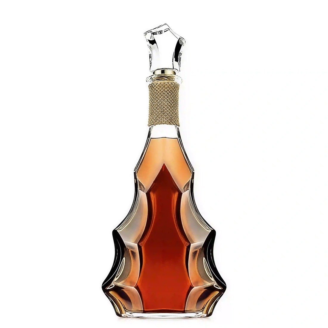
The world of glass manufacturing offers a vast palette of possibilities beyond the standard round or square profiles. The pursuit of a unique brand identity compels distillers to explore custom shapes that defy convention and capture the imagination. Consider the challenge: how does a new gin brand distinguish itself from the hundreds already on the market? The answer often lies in the glass. A brand might opt for a hexagonal base that creates intriguing light refractions, a subtle twist in the body of the bottle that evokes the botanicals within, or an asymmetric shoulder that feels modern and dynamic. These are not mere decorative flourishes; they are strategic decisions designed to create an “ownable” shape. An ownable shape is a silhouette so unique to a brand that it becomes synonymous with it. When a consumer sees that shape, they think of that specific brand, and no other. Achieving this requires a deep understanding of both design principles and the technical capabilities of glass production. It involves exploring subtle variations in the neck length, the shoulder angle, the punt depth, and the base geometry. For brands seeking to make a statement, investing in a proprietary mold for a truly custom glass bottles is not an extravagance but a crucial investment in long-term brand equity. This unique silhouette becomes a piece of intellectual property, a constant and silent advertisement that works for the brand wherever the bottle is seen.
The Semiotics of Shape: What Do Curves and Angles Communicate?
Every line, curve, and angle in a bottle’s design carries a set of cultural and psychological associations. The study of these signs and symbols is known as semiotics, and it is a vital tool in bottle design. Let us examine some of these associations. Soft, rounded curves, as seen in many rum or brandy bottles, tend to communicate warmth, accessibility, and a sense of organic, natural smoothness. They can feel more feminine or gentle. In contrast, sharp angles, flat panels, and strong geometric lines, often found in vodka or modern gin bottles, convey precision, modernity, technical purity, and a more masculine or assertive character. A tall, slender bottle might suggest elegance, lightness, and sophistication, making it a common choice for premium vodkas and gins. A short, stout, and broad-shouldered bottle, typical of many American whiskeys, communicates strength, tradition, robustness, and a grounded, unpretentious character. The taper of the bottle is also significant. A bottle that tapers towards the top can feel more aspiring and elegant, while one with a straight, columnar profile feels more solid and stable. By deliberately combining these design elements, a brand can sculpt a bottle that wordlessly communicates its core values. A craft distillery using locally foraged botanicals might choose a shape with soft curves and an organic feel, while a brand emphasizing its advanced filtration process might opt for a sharp, clinical, architectural form.
| Shape Profile | Commonly Associated Spirits | Communicated Attributes & Perceptions |
|---|---|---|
| Boston Round / Nordic | Gin, Vodka, Liqueurs | Classic, medicinal, simple, versatile, approachable |
| Square / Rectangular | Whiskey, Bourbon, Gin | Bold, masculine, modern, stable, confident, highlights clarity |
| Tall & Slender (e.g., Belveder) | Vodka, Premium Gin | Elegant, sophisticated, premium, light, aspiring |
| Short & Stout (e.g., Maker’s Mark) | Bourbon, Scotch, Aged Rum | Traditional, robust, strong, authentic, grounded |
| Ornate / Custom Sculpted | Tequila, Cognac, Ultra-Premium | Artisanal, luxurious, celebratory, unique, story-driven |
Case Studies in Iconic Shapes: From Absolut to Maker’s Mark
The history of spirits is filled with examples of brands that have achieved iconic status in large part due to their distinctive bottle shapes. The Absolut Vodka bottle is a masterclass in this principle. In a category dominated by traditional, often Russian-inspired ornate bottles, Absolut introduced a shape based on a 19th-century Swedish medicine bottle. Its simple, clean lines, short neck, and lack of a paper label were revolutionary. The bottle itself became the brand, a canvas for decades of creative advertising. Its shape is so recognizable that it can be depicted in silhouette or abstract form and still be immediately identified as Absolut. Another powerful example is Maker’s Mark bourbon. The brand’s squat, square-shouldered bottle with its hand-dipped red wax seal is instantly recognizable. The shape feels honest and unpretentious, perfectly reflecting the brand’s narrative of handcrafted quality. It stands in stark contrast to the taller, more elegant bottles of some of its competitors, carving out a unique visual and tactile identity. Similarly, the Patrón tequila bottle, with its hand-numbered label and beehive-like shape, elevated the perception of tequila from a simple spirit to a luxury craft product. The bottle felt more like a fine perfume decanter than a typical tequila bottle, a strategic choice that helped redefine the entire category. These examples demonstrate that the most successful brands do not simply choose a container; they design an icon. The role of bottle weight and shape in premium spirit branding is not merely about aesthetics; it is about creating a lasting and powerful symbol of the brand’s identity.
3. The Ergonomics of Experience: The Handshake with the Consumer
Beyond the initial visual and tactile judgments, the design of a spirit bottle must contend with a more practical, yet equally crucial, dimension: its use. Ergonomics, the science of designing for human use, plays a profound role in shaping the consumer’s ongoing relationship with the product. A bottle is not a static sculpture; it is a tool designed to be held, lifted, carried, and, most importantly, poured. Each of these interactions is a touchpoint, an opportunity to either delight or frustrate the user. A bottle that feels good in the hand, that pours cleanly without dripping, and that is easy for a bartender to grab and handle during a busy service contributes positively to the overall brand experience. Conversely, a bottle that is awkward to hold, unbalanced, or prone to messy pours can introduce a subtle but persistent element of annoyance, undermining the premium perception the brand seeks to cultivate. The ergonomic design of the bottle is, in essence, the brand’s handshake with the consumer and the bartender—it can be firm, confident, and pleasing, or it can be clumsy and forgettable. A thoughtful approach to ergonomics demonstrates a deep consideration for the user, a hallmark of any true luxury product.
The Pouring Ritual: How Shape Influences Usability
The act of pouring a spirit is a moment of ceremony. Whether it is a measured pour into a jigger, a generous splash into a tumbler, or a delicate stream into a cocktail shaker, this action is central to the product’s use. The shape of the bottle’s neck and shoulders has an enormous impact on the quality of this experience. A well-designed neck allows for a smooth, controllable, “glug-free” pour. The length and diameter of the neck must be carefully calibrated to manage the flow of both the liquid and the air replacing it inside the bottle. A poorly designed neck can cause the liquid to surge or splash, leading to over-pours and drips—minor frustrations that detract from a premium feel. The finish of the lip is also vital. A sharp, well-defined lip provides a clean cut-off point for the liquid, preventing it from running down the side of the bottle. Some ultra-premium brands even incorporate a subtle pour spout directly into the glass design. The overall shape and weight distribution of the bottle also affect the pour. A top-heavy bottle can be difficult to tilt and control accurately, particularly when full. A well-balanced bottle, where the center of gravity feels natural in the hand, makes pouring feel effortless and precise. This focus on the pouring ritual is not trivial; it is an acknowledgment that the consumer’s interaction with the product does not end at the point of sale.
Grip, Balance, and the Bartender’s Perspective
While the end consumer is a primary audience, the professional bartender is a hugely influential gatekeeper. A bartender may handle a particular bottle dozens or even hundreds of time in a single shift. For them, ergonomics is not a luxury; it is a necessity. A bottle’s design must accommodate the practical realities of a fast-paced bar environment. The diameter of the bottle is a key consideration. Can it be gripped confidently with one hand? Is there a natural place for the fingers and thumb to rest? Some designs incorporate subtle indentations or textures to improve grip, a feature that is especially valuable in a potentially wet or humid environment. The overall shape must also be compatible with a bartender’s “speed rail”—the metal rack where high-use bottles are stored. A bottle with an overly complex or wide base may not fit, relegating it to the back bar and potentially reducing its sales velocity. The weight, again, is a factor. While a heavy bottle signals quality to the consumer, an excessively heavy bottle can lead to fatigue for a bartender over the course of a long night. The ideal design finds the sweet spot: a bottle with enough heft to feel premium but balanced and shaped for easy, repetitive handling. Brands that consult with professional bartenders during the design process often gain invaluable insights, resulting in a bottle that is not only beautiful but also a pleasure to work with, earning the appreciation and loyalty of the professionals who sell it most.
Designing for the Moment of Consumption
The ergonomic experience extends to the entire context of consumption. Consider the different environments where a spirit might be enjoyed. A bottle destined for a high-energy nightclub has different ergonomic requirements than one intended for quiet enjoyment at home. For example, a bottle with a unique shape that is difficult to see in low lighting might be a liability in a club, whereas a bottle with a tactile element, like an embossed pattern, could be a benefit. The closure system is another critical ergonomic component. A cork provides a satisfying “pop” and a sense of tradition, but a screw cap might be more practical for a bottle that will be opened and closed frequently. The design of the closure itself—its size, shape, and material—affects how easy it is to open, especially for consumers who may have limited grip strength. The ultimate goal of ergonomic design is to make the use of the product feel seamless and intuitive. Every interaction, from picking it up to the final pour, should feel natural and satisfying. When a bottle’s design achieves this, it becomes more than just a container. It becomes a well-crafted tool, and the user’s appreciation for its thoughtful design is subconsciously transferred to the brand and the liquid inside. This deep consideration for the user’s physical experience is a subtle but powerful component of the role of bottle weight and shape in premium spirit branding.
4. Cultural Resonance: Adapting Form for Global Markets
A spirit bottle does not exist in a vacuum. It is a cultural artifact, and its design is interpreted through the specific lens of the market in which it is sold. The shapes, weights, and decorative elements that signal “luxury” or “authenticity” in one country may communicate something entirely different in another. For a brand with global ambitions, a one-size-fits-all approach to bottle design can be perilous. Understanding the distinct cultural preferences and aesthetic sensibilities of key markets—such as the United States, Europe, and Russia—is not merely an exercise in marketing; it is a fundamental requirement for establishing a successful international presence. The design must resonate with local conceptions of quality, tradition, and style. This involves a nuanced understanding of history, consumer behavior, and the existing visual landscape of the spirits category in each region. A bottle that is perceived as elegantly minimalist in Scandinavia might be seen as plain or cheap in Russia, while a design celebrated as bold and modern in the USA could be viewed as brash or lacking heritage in France. Successfully navigating these diverse cultural waters is a hallmark of sophisticated global branding.
American Boldness: The Appeal of Strong, Assertive Shapes
The American market, particularly for spirits like bourbon and American whiskey, often responds to bottle designs that project strength, confidence, and a sense of rugged individualism. This is reflected in the prevalence of broad-shouldered, heavy-based, and often squarish bottles. These forms have a commanding presence on the shelf and feel substantial in the hand, aligning with a cultural appreciation for things that are solid, well-built, and enduring. The aesthetic often leans towards the functional and the authentic. A design that feels like it could have come from a 19th-century saloon, with clear embossing and a straightforward form, can signal heritage and craftsmanship. Think of the classic shapes used by brands like Jack Daniel’s or Wild Turkey. Even for other spirits like vodka or gin, there is an appreciation for clean, bold designs that make a clear statement. While ornate European styles can find a niche, the core of the market often gravitates towards shapes that are assertive and unambiguous. The weight of the bottle plays a particularly significant role here, as the haptic sense of substance strongly reinforces messages of quality and premium positioning in the American consumer’s mind.
European Elegance: Tradition, Minimalism, and Sophistication
The European market is, of course, not monolithic, but certain general trends can be observed. In many parts of Europe, particularly in countries with long-standing distillation traditions like France, Scotland, and Italy, there is a deep appreciation for elegance, tradition, and understatement. For spirits like Cognac, Scotch whisky, and fine gin, bottle designs often reflect this. Shapes may be more curved and refined, with longer, more graceful necks and a focus on beautiful proportions. The “Bordeaux” or “Burgundy” style wine bottle shapes have heavily influenced spirit bottle design, suggesting a shared heritage of agricultural craftsmanship. In other parts of Europe, particularly Scandinavia and Germany, a minimalist aesthetic holds significant sway. Here, luxury is communicated not through ornamentation but through purity of form, exceptional clarity of the glass, and precision in the design. The bottle becomes a frame for the spirit itself, with a focus on simplicity and functionality. Across the continent, there is a strong connection between shape and a spirit’s origin. A gin brand might use a shape reminiscent of an old Dutch genever bottle to signal its historical roots, while a Scotch brand will almost invariably use a shape that is instantly recognizable as belonging to that category. For brands entering the European market, demonstrating an understanding of these established visual codes is crucial for being perceived as authentic and credible.
Russian Grandeur: The Preference for Ornate and Substantial Designs
The Russian market for premium spirits, especially vodka, presents a distinct set of aesthetic preferences. Historically and culturally, there is a strong association between luxury and a certain level of grandeur and ornamentation. While minimalist designs have gained some traction, the premium and super-premium segments are often characterized by bottles that are visually impressive and unabashedly luxurious. This can manifest in several ways. Heavyweight glass is almost a prerequisite for a premium vodka brand in Russia; the physical substance of the bottle is a direct signal of its value. Shapes are often tall and imposing, designed to stand out on a crowded shelf and project an image of power and prestige. Decorative elements that might be considered excessive in other markets are often embraced. This includes intricate embossing, the use of metallic or frosted finishes, and sometimes even the incorporation of non-glass elements. The bottle is not just a container; it is a centerpiece, a symbol of status and celebration. For a brand like Beluga Noble Russian Vodka, the heavy, clear bottle with its small, raised metal fish emblem is a perfect example of this philosophy. It is a design that communicates its premium status with confidence and a touch of opulence, resonating deeply with the expectations of its target market. Understanding this preference for visible, tangible value is key to succeeding in Russia’s competitive spirits landscape.
| Design Element | USA Market Preference | European Market Preference | Russian Market Preference |
|---|---|---|---|
| Weight | Heavy, substantial base. Signals quality and robustness. | Varies. Heavy for luxury Scotch/Cognac, but minimalism values form over mass. | Very heavy. Weight is a primary and direct indicator of premium quality. |
| Shape | Bold, strong, often square or rectangular. Assertive and confident silhouettes. | Elegant, traditional curves (e.g., Cognac) or clean, functional minimalism (e.g., Nordic). | Tall, imposing, often with unique or ornate profiles to project status. |
| Decoration | Often clean, with focus on embossing and label design. Authenticity is key. | Understated. Quality of glass and purity of form often prioritized over decoration. | Can be more ornate. Frosting, metallic elements, and decorative features are common. |
| Psychological Cue | “Built to last,” “Authentic,” “Confident.” | “Elegant,” “Traditional,” “Sophisticated,” “Pure.” | “Luxurious,” “Grand,” “Prestigious,” “Celebratory.” |
5. The Unseen Advantage: Logistical and Production Realities
While the aesthetic and psychological dimensions of bottle design are captivating, they must always be tethered to the unyielding realities of manufacturing and logistics. A breathtakingly beautiful and conceptually brilliant bottle design is of little value if it cannot be produced consistently at scale, if it is prohibitively expensive, or if it creates insurmountable challenges in shipping and handling. The journey from a designer’s sketch to a filled bottle on a retail shelf is fraught with technical constraints and practical considerations. The most successful brands are those that find the perfect equilibrium between a powerful creative vision and a pragmatic understanding of the production process. This involves a close collaboration between brand managers, designers, and experienced fabricante de envases de vidrios. Overlooking these practical aspects can lead to budget overruns, production delays, and unforeseen compromises that dilute the brand’s identity. Therefore, a deep appreciation for the “unseen” factors of production and logistics is not a hindrance to creativity but a prerequisite for its successful execution.
The Manufacturing Process: Balancing Bespoke Design with Feasibility
The creation of a glass bottle is a dance between molten glass, immense heat, and high-precision machinery. Every curve, angle, and detail of a design must conform to the physics of this process. For example, very sharp internal angles can create stress points in the glass, making the bottle more susceptible to breakage during production or transport. An overly complex shape with deep, narrow indentations may be difficult to form correctly in the molds or release cleanly, leading to a high rejection rate and increased costs. The thickness of the glass wall is another critical factor. While a thick, heavy base communicates luxury, the distribution of glass throughout the bottle must be relatively even to ensure structural integrity and prevent weak spots. This is where the expertise of the glass manufacturer becomes invaluable. They can provide feedback on a proposed design, suggesting subtle modifications that will make it more manufacturable without compromising the core aesthetic intent. They can advise on the feasibility of complex embossing, the tolerances required for a perfect closure fit, and the types of glass (e.g., flint, super flint) that will best achieve the desired clarity and brilliance. The decision to invest in a custom mold versus using a stock bottle with custom decoration is also a key strategic choice, balancing the desire for uniqueness against budget and volume considerations. A successful design is one that pushes the boundaries of creativity while respecting the fundamental principles of glass manufacturing.
Weight, Shipping, and the Carbon Footprint
The decision to use a heavy bottle has cascading consequences that extend far beyond the consumer’s perception of quality. The most immediate impact is on logistics. Weight is a primary component of shipping costs, both from the manufacturer to the distillery and from the distillery to the distributor and retailer. A heavier bottle means fewer units can be packed into a standard case or onto a pallet without exceeding weight limits, increasing the per-unit cost of transportation. This is a significant factor for brands with wide distribution, especially those exporting internationally. A case of 12 standard-weight bottles might weigh 15kg, while a case of heavyweight bottles could easily exceed 20kg. Over thousands of cases, this difference adds up to a substantial financial and logistical burden. Furthermore, in an age of increasing environmental consciousness, the carbon footprint of packaging is under intense scrutiny. A heavier bottle requires more raw materials (sand, soda ash, limestone) and more energy to melt and form. The increased weight also translates to higher fuel consumption during transportation, further adding to its environmental impact. While the luxury perception of a heavy bottle is undeniable, brands must now weigh this benefit against the growing demand from consumers and regulators for more sustainable practices. This has led to innovations in “lightweighting,” where manufacturers use advanced design and production techniques to reduce a bottle’s weight without sacrificing its structural integrity or premium feel.
Shelf Space and Retail Presence: The Practicality of Form
A bottle’s journey ends on the retail shelf, where it must compete for both visual attention and physical space. The dimensions of the bottle—its height, width, and depth (its “footprint”)—are of immense practical importance to retailers. Shelf depth and height are standardized in most retail environments. A bottle that is too tall may not fit on a standard shelf, forcing retailers to place it on a top shelf with less visibility or not carry it at all. A bottle with an unusually wide or irregular footprint takes up more valuable shelf space than a standard cylindrical or square bottle. A retailer might be able to fit ten standard bottles in a row but only seven of a more eccentric shape. This reduces the retailer’s potential revenue per square foot, making them less inclined to give the product a prime position. The shape must also be stable. A bottle with a narrow base and a high center of gravity is more likely to be tipped over and broken, creating a hazard and a loss for the retailer. The ability of the bottle to be packed efficiently into a shipping case is another consideration. Irregular shapes can lead to “wasted” space within a case, meaning fewer bottles can be shipped per box, again increasing costs and reducing efficiency. The ideal design, therefore, is one that is distinctive and eye-catching yet still conforms to the practical dimensional and stability requirements of the retail and logistics chain. It is a design that is mindful of its entire journey, from the factory floor to the customer’s shopping cart.
6. Sensory Synergy: How Bottle Design Primes the Palate
The experience of a premium spirit is a holistic one, a symphony played across all the senses. While taste and aroma are the lead instruments, the preceding sensory cues from the packaging act as the conductor, setting the stage and influencing our perception of the final performance. The design of the bottle does not merely contain the liquid; it primes the consumer’s palate. Through a fascinating psychological phenomenon known as cross-modal perception, what we see and feel can fundamentally alter what we taste and smell. A bottle that looks and feels luxurious, elegant, or rustic creates an expectation in the consumer’s mind, a cognitive framework through which they will interpret the spirit itself. This sensory synergy, where the visual and tactile qualities of the bottle blend with the gustatory and olfactory properties of the liquid, is a powerful tool in the arsenal of a premium brand. By carefully orchestrating these initial sensory inputs, a brand can guide the consumer’s experience, enhancing perceived smoothness, complexity, and overall quality. The role of bottle weight and shape in premium spirit branding extends, therefore, deep into the realm of sensory science.
Cross-modal Perception: When Touch and Sight Influence Taste
Cross-modal perception is the principle that our senses do not operate in isolation but constantly influence one another. The brain seamlessly integrates information from sight, sound, touch, and smell to create a unified perception of the world. This has profound implications for food and beverage consumption. For example, numerous studies have shown that the color of a drink can influence its perceived flavor—a pink-colored beverage might be perceived as sweeter than an identical but colorless one. The same principle applies to the bottle. When a consumer holds a heavy, substantial bottle (touch), with a sophisticated shape and crystal-clear glass (sight), their brain begins to build a narrative of quality. This expectation of quality can lead them to perceive the spirit as smoother, more complex, or more pleasant than they would if it were served from a lightweight, generic plastic bottle. This is not simply a placebo effect; the brain’s flavor-processing regions are genuinely influenced by these external cues. A brand that invests in a premium bottle is, in effect, investing in a better-tasting product in the mind of the consumer. The heft of the bottle might suggest a richer mouthfeel, while an elegant, slender shape might prime the palate for crisp, clean flavors. By understanding these cross-modal connections, designers can create packaging that works in concert with the spirit to deliver a heightened and more memorable sensory experience.
The Color and Clarity of Glass: A Window to the Spirit
The glass itself is a critical component of this sensory priming. The choice of glass color and clarity is a strategic decision that frames the consumer’s first visual encounter with the liquid. For spirits like whiskey, rum, and brandy, where the color derived from barrel aging is a key indicator of age and character, high-clarity “super flint” glass is often the preferred choice. It acts as a crystal-clear window, allowing the rich amber, gold, and mahogany hues to shine through, promising complexity and flavor before the bottle is even opened. The clarity of the glass communicates purity and quality, suggesting that the brand has nothing to hide. Conversely, for spirits like gin or certain liqueurs, colored glass can be used to great effect. A blue-tinted bottle, like that of Bombay Sapphire, can evoke the cool, crisp botanicals within and create a striking visual identity. A dark amber or green bottle, often used for herbal liqueurs or some whiskeys, can protect the contents from light and convey a sense of tradition, mystery, or medicinal origins. The finish of the glass also plays a role. A frosted finish can suggest coldness and purity, a popular choice for premium vodkas, while a glossy, polished finish enhances the perception of luxury. Each choice sends a signal, shaping expectations and contributing to the overall narrative of the brand.
The Role of the Closure: Cork, Cap, and the Opening Ceremony
The final sensory interaction before tasting is the opening of the bottle. This act is a small but potent piece of theater, and the choice of closure is its central prop. The traditional natural cork remains a powerful symbol of quality and heritage. The ritual of removing a cork—the gentle resistance, the satisfying “pop”—is deeply ingrained in our culture as an indicator of a premium product, borrowed from the world of fine wine. It is a multi-sensory experience involving sight, sound, and touch that builds anticipation for the liquid within. The material of the stopper itself, whether it be wood, glass, or metal, adds another layer of tactile information, contributing to the perceived value. However, alternatives to cork also have their own sensory language. A well-engineered screw cap, particularly one with a satisfying weight and a smooth action, can communicate precision, modernity, and convenience. For a spirit that is meant to be resealed multiple times, a high-quality screw cap can be a more practical and reliable choice, preventing evaporation and preserving the spirit’s integrity. Some brands have turned the closure into a signature design element, like the iconic metal stirrup and jockey on Blanton’s bourbon or the hand-dipped wax seal of Maker’s Mark. These closures transform the simple act of opening the bottle into a memorable brand moment, the final step in the sensory journey that the bottle orchestrates before the first drop is poured.
7. The Future of Form: Innovation in Glass Bottle Design
The world of spirit packaging, while steeped in tradition, is not static. It is a dynamic field where new technologies, shifting consumer values, and creative pressures are constantly pushing the boundaries of what is possible. The future of bottle design lies at the intersection of heritage and innovation, challenging brands to rethink the very nature of the vessel. As we look ahead, three key areas of development are set to redefine the role of bottle weight and shape in premium spirit branding: the urgent push for sustainability, the integration of digital technology, and the accelerating demand for personalization and uniqueness. Brands that embrace these changes will not only stay relevant but will lead the conversation, crafting bottles that are not just beautiful and functional but also responsible, intelligent, and deeply personal. The bottle of the future will do more than just contain a spirit; it will tell a richer, more complex story than ever before.
Sustainable Luxury: Lightweighting and Recycled Materials
The most significant force shaping the future of glass packaging is the global imperative for sustainability. For years, the premium spirits industry has relied on the “heavy bottle equals quality” equation. However, this paradigm is being challenged by the environmental cost associated with producing and shipping heavy glass. The future of luxury will involve reconciling premium aesthetics with ecological responsibility. This is driving immense innovation in two key areas: lightweighting and the use of recycled content. “Lightweighting” is not simply about making a thinner, weaker bottle. It is a sophisticated engineering process that uses advanced computer modeling to optimize the bottle’s structure, removing weight from non-critical areas while maintaining strength and the perception of quality. A cleverly designed punt or a thicker base can preserve the premium feel in the hand, even if the overall weight is reduced by 20-30%. The second frontier is the increased use of post-consumer recycled (PCR) glass. Historically, using high percentages of PCR glass was challenging for premium spirits because it could result in slight color variations or imperfections. However, advancements in sorting and processing technology are making it possible to create high-clarity, high-quality “eco-glass” with significant recycled content. Brands are now turning this into a marketing advantage, proudly displaying the recycled content percentage on their labels. This re-frames “luxury” to include not just craftsmanship and material quality, but also environmental stewardship, appealing to a new generation of conscientious consumers.
Smart Bottles: Integrating Technology into Packaging
The bottle is evolving from a passive container into an active digital platform. The integration of technologies like Near Field Communication (NFC) and QR codes is transforming the bottle into a bridge between the physical product and a rich digital world. A small, invisible NFC tag embedded in the label or cork can allow a consumer to tap their smartphone to the bottle and instantly access a wealth of information. This could include detailed tasting notes from the master distiller, a virtual tour of the distillery, cocktail recipes, or even a blockchain-verified certificate of authenticity to combat counterfeiting. This technology offers immense potential for storytelling and consumer engagement. Imagine a whiskey bottle that, when tapped, reveals the exact barrels it was aged in and the story of the cooper who made them. For brands, this provides a direct line of communication with the consumer, long after the point of sale. It also offers valuable data on when and where their products are being opened and consumed. As this technology becomes more seamless and affordable, the bottle will cease to be the end of the brand’s message; it will become the beginning of an interactive conversation, adding a new, digital dimension to the consumer experience.
Personalization and Limited Editions: The Rise of Customization
In a world of mass production, consumers are increasingly seeking products that feel unique and personal. This trend is driving a surge in demand for limited editions, special releases, and customizable packaging. The future of bottle design will be more agile and responsive, allowing for greater levels of personalization. Digital glass printing technology, for example, is making it easier to create intricate, full-color designs directly on the glass without the need for paper labels, opening up new possibilities for short-run, highly decorative bottles. Brands can release city-specific editions, bottles commemorating special events, or even allow consumers to add their own message or name to a bottle for gifting. This level of customization transforms the bottle from a simple product into a personal keepsake or a collector’s item. The use of a diverse portfolio of spirits glass bottles allows brands to create a family of products with a cohesive identity but with unique characteristics for each expression—a standard shape for the core range, a more ornate version for the aged reserve, and a completely bespoke bottle for an ultra-rare release. This strategy allows brands to cater to different segments of the market, from the everyday enthusiast to the high-end collector, all while reinforcing the core brand identity. This focus on uniqueness and personal connection ensures that even in a crowded market, a brand can offer a product that feels truly one-of-a-kind. For any brand looking to innovate, partnering with a manufacturer who can offer a diverse portfolio of spirits glass bottles and custom capabilities is paramount.
Frequently Asked Questions
- How much does a heavier bottle actually increase the cost of a spirit?
- The cost increase from a heavier bottle is multi-faceted. The bottle itself costs more due to the increased raw materials and energy required for production. Shipping and logistics costs also rise significantly, as fewer units can be transported per shipment due to weight limits. While exact figures vary, this can add anywhere from a few cents to several dollars to the final cost of a single unit, a substantial margin in a competitive market.
- Is a square bottle or a round bottle better for a new spirit brand?
- The choice depends entirely on the brand’s desired identity. A round bottle (like a Boston Round or Nordic style) is classic, versatile, and often more efficient to manufacture and label. It can convey simplicity and tradition. A square bottle tends to feel more modern, bold, and masculine, making a stronger statement on the shelf. It’s an excellent choice for a brand wanting to project confidence and a premium, architectural aesthetic, like many high-end gins and whiskeys.
- Can the shape of a bottle really affect the taste of the spirit?
- While the shape does not change the chemical composition of the spirit, it absolutely can affect the perceived taste due to cross-modal psychology. An elegant, slender bottle can create an expectation of light, crisp flavors, while a heavy, robust bottle can prime the consumer to expect rich, complex, and smooth flavors. This psychological priming is a powerful, well-documented phenomenon that influences the entire tasting experience.
- What is “super flint” glass, and is it necessary for a premium brand?
- Super flint glass is a type of high-quality glass with exceptional clarity and brilliance, achieved by using raw materials with very low iron oxide content. This prevents the faint greenish tint seen in standard glass. For spirits where the liquid’s color is a key selling point (like aged whiskey, rum, or cognac), super flint glass is highly recommended as it acts like a crystal-clear window, showcasing the spirit’s true color and signaling premium quality.
- How do I balance a unique bottle design with the practicalities of bottling and labeling?
- The key is early collaboration with your glass manufacturer and bottling facility. Discuss your design concepts with them before finalizing. An experienced manufacturer can identify potential issues, such as shapes that are difficult to grip for bottling machinery or surfaces where labels won’t adhere smoothly. They can often suggest minor tweaks that preserve your design’s intent while ensuring it is efficient and cost-effective to produce and handle.
- Does a cork closure always signal higher quality than a screw cap?
- Traditionally, yes. The ritual of uncorking is strongly associated with fine wine and premium products. However, perceptions are changing. A poorly made cork can taint a spirit, while a high-quality, well-engineered screw cap can provide a superior seal and convey a sense of modern precision and reliability. For many spirits, especially those opened frequently like vodka or gin, a premium screw cap is now seen as a practical and sophisticated choice.
- What is the first step in creating a custom bottle for my spirit brand?
- The first step is to deeply define your brand identity. What is your story? Who is your target audience? What feelings and attributes do you want to communicate (e.g., modern, traditional, rustic, luxurious)? Once you have a clear brand concept, you can begin sketching ideas and, most importantly, engage in a conversation with a specialized glass bottle manufacturer. They can guide you through the process, from technical drawings and 3D renderings to mold development and final production.
Conclusión
The examination of a spirit bottle’s physical characteristics reveals a deep and intricate connection between material form and perceived value. It is clear that the vessel is not an afterthought but a primary author of the brand’s story. The weight communicates substance, leveraging a primal psychological heuristic that equates mass with worth. The shape provides an immediate visual identity, a silhouette that can become an iconic and instantly recognizable brand asset. These elements work in synergy, influencing not only the initial purchase decision but also the ergonomic experience of the pour and even the sensory perception of the spirit’s taste. As we navigate the complexities of global markets and the demands of sustainability, the strategic importance of this discipline only intensifies. For distillers and brand owners, mastering the silent language of glass—understanding the profound role of bottle weight and shape in premium spirit branding—is fundamental. It is the art and science of transforming a simple container into a resonant symbol of quality, craftsmanship, and desirability, ensuring the brand’s narrative is compellingly told long before the first sip. Finding a reliable glass packaging partner who understands this complex interplay is therefore not just a sourcing decision, but a foundational step in building a lasting and successful spirit brand.
References
- Krishna, A., & Morrin, M. (2008). Does touch affect taste? The effect of haptic cues on sensory perceptions and brand evaluations. Journal of Consumer Research, 34(6), 807–818. https://doi.org/10.1086/523289
- Spence, C. (2019). On the surprising impact of taste and flavour on perception and cognition. The Cambridge Handbook of the Imagination, 355–370. https://www.cambridge.org/core/books/cambridge-handbook-of-the-imagination/on-the-surprising-impact-of-taste-and-flavour-on-perception-and-cognition/66D35E346614488A6F00D3088C3C910B
- Piqueras-Fiszman, B., & Spence, C. (2015). Sensory expectations based on product-extrinsic cues: The case of sound and colour. Current Opinion in Food Science, 3, 132-137. https://doi.org/10.1016/j.cofs.2015.04.001
- Schifferstein, H. N. J. (2009). The perceived importance of sensory modalities in product usage: A study of self-reports. Acta Psychologica, 130(3), 202-214. https://doi.org/10.1016/j.actpsy.2008.12.006
- Seekbottles. (2023, July 23). Round VS Square Liquor Bottle. Seekbottles.
- Kandacork Glass. (2023, August 10). The Ultimate Guide to Whiskey Bottles: Shapes, Sizes, Labels, and Collectibles. Kandacork.
- Ackerman, J. M., Nocera, C. C., & Bargh, J. A. (2010). Incidental haptic sensations influence social judgments and decisions. Science, 328(5986), 1712-1715. https://doi.org/10.1126/science.1189993
- Ruisheng Glass. (n.d.). China Liquor Glass Bottle Manufacturer & Supplier.